Resources & Tools
Resources and Tools
View All
Safety Topic
Wellness and Support Guide
Resources and services to support your well-being and psychological safety at work.
View Safety TopicThis safety huddle will help you develop a bullying and harassment policy for your organization.
Files Attached
Training & Education
Training and Education
View All
Immersive learning
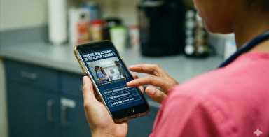
OntheJob violence prevention training: Real scenarios. Real insights. Safer workplaces.
Ready to tackle violence prevention in healthcare? Discover our immersive, scenario-based training that identifies hidden risks and boosts your team's competency!
View Immersive learningPrograms & Services
Programs and Services
View All
We are dedicated to providing comprehensive occupational health and safety (OHS) consulting services tailored to your needs.
View ServicePsychological health and safety, often called workplace mental health, encompasses principles and practices to foster a supportive, respectful, and psychologically safe work environment.
View ServiceThe Provincial Violence Prevention Curriculum is recognized as best-practice in violence prevention training for health care workers.
View ServiceGuidelines & Regulations
Guidelines and Regulations
View All
MSI prevention is the focus of the 2026 WorkSafeBC inspection initiative. Learn how to protect long-term care staff and improve your safety outcomes today!
View News StoryWorkSafeBC is holding a second public hearing this month on proposed changes to the Occupational Health and Safety Regulation related to combustible dusts.
View News StoryGuidelines and Regulations
Regulatory News


